The Transformation
Before & After
 After
AfterDrag the slider to compare
The Transformation
AfterDrag the slider to compare
The Voice
Bilingual bridge-builder who honors sacrifice while delivering speed. Speaks remittance corridors fluently. Validates dual-country pressures with transparent urgency.
Brand Manifesto
You work hard for every dollar. You sacrifice today so someone you love can have a better tomorrow. You carry the weight of two worlds — the one you're building and the one you left behind.
We see you.
For over 170 years, Western Union has stood beside families like yours, understanding that when you send money across borders, you're sending so much more. You're sending a child to school. You're sending medicine to a parent. You're sending proof that distance changes nothing about love.
You deserve a partner who treats your hard-earned money with the respect it demands. That's why we've built a network of 500,000+ locations combined with transparent digital experiences — so you can send money your way, on your terms, with complete clarity about every fee and every step. No hidden costs. No confusing terms. Just honest service that honors your sacrifice.
Because love moves. And we deliver it — every time, everywhere, without fail.
Moving money. Moving hearts.
Formality
Enthusiasm
Boldness
Innovation
Playfulness
Trust
proven / verified / secure / protected / guaranteed / established / reliable
Value
transparent / upfront / honest / clear / dependable / fair / straightforward
Action
bridge / honor / deliver / connect / empower / protect / guide
Emotion
sacrifice / dedication / care / commitment / pride / relief / belonging
“Send more than money. Send love, hope, and possibility. Move what matters most with Western Union.”
Color Transformation
Before
Western Union Yellow
#FFDD00
Black
#0A0B09
2 colors. Zero emotional range.
After
Split-complementaryFoundation: Compassionate Core
Typography
Before
Smarter. Safer. Together.
Western Union provides a reliable, secure, and fast way to send and receive money globally.
Generic corporate sans-serif with no distinctive personality
After — Classic Pairing
Lora — Headings
Love moves. We deliver it.
Aa Bb Cc Dd Ee Ff Gg Hh
Regular — Love moves. We deliver it.
SemiBold — Love moves. We deliver it.
Bold — Love moves. We deliver it.
Open Sans — Body
You work hard for every dollar. You sacrifice today so someone you love can have a better tomorrow. You carry the weight of two worlds — the one you're building and the one you left behind.
Open Sans · Weights 300–800
Mockups
You work two jobs, send money home every month, and carry two countries in your heart. We see you.
The Challenge
Western Union processes over $100 billion in transfers annually across 200+ countries with 500,000+ agent locations. Yet its brand felt invisible to the very people it served. A 170-year heritage reduced to a yellow sign at a convenience store counter. While fintech challengers like Wise, Remitly, and Revolut captured hearts with transparent pricing and modern digital experiences, Western Union's identity remained stuck in transactional utility — 'send money' — with zero emotional language around the sacrifice, love, and family connection that drives every single transfer.
Current identity — “Smarter. Safer. Together.”
01
Visual identity is dated, generically corporate, and entirely transactional — no emotional resonance whatsoever
02
Brand narrative is purely functional ('send money') with zero emotional language around connection, family, or sacrifice
The Strategic Foundation
Brand Archetype
with secondary The Hero
Western Union exists to protect and enable families separated by borders. Every transaction represents sacrifice, duty, and love — core Caregiver motivations. The secondary Hero archetype empowers customers as the heroes of their own family stories.
Brand Purpose
Western Union exists to honor the invisible labor of connection — the millions of people who span borders, hold families together, and build futures from two worlds at once. We move money. We move lives.
Brand Vision
By 2036, Western Union will be the world's most trusted financial ally for the global diaspora — recognized not just for moving money, but for transforming how the world understands the economic and emotional power of immigrant communities.
Brand Positioning
For diaspora families who carry the weight of two worlds, we are the trusted financial ally that honors every sacrifice behind your transfer with transparent pricing, guaranteed delivery, and 500,000+ locations where care meets convenience — because moving money should feel as human as the love that drives it.
03
Perceived as expensive against digital-first competitors who lead with transparent pricing
04
No connection to the diaspora communities that represent 90%+ of its customer base
Challenging: Wise / Remitly / Revolut / MoneyGram / PayPal (Xoom) / Ria
Visual System
Brand Color
Reverse

Monochrome
Vertical
Brand Values
We earn trust through consistent, reliable service that honors the weight of every dollar sent across borders.
We exist to bridge the physical distances that separate families — creating seamless experiences that keep loved ones close.
Impact Analysis
Scores generated by our AI analysis engine measuring brand coherence, audience alignment, and strategic effectiveness.
Emotional Connection
AI-analyzed audience resonance score measuring how deeply the brand connects with its core diaspora audience
Brand Coherence
Overall alignment score across purpose, values, positioning, archetype, and visual identity
Essence Alignment
Full Brand Guidelines
Dive deeper into Western Union's rebrand — from voice guidelines to design tokens, every detail is documented in the interactive brand book.
View Brand BookIcon Only
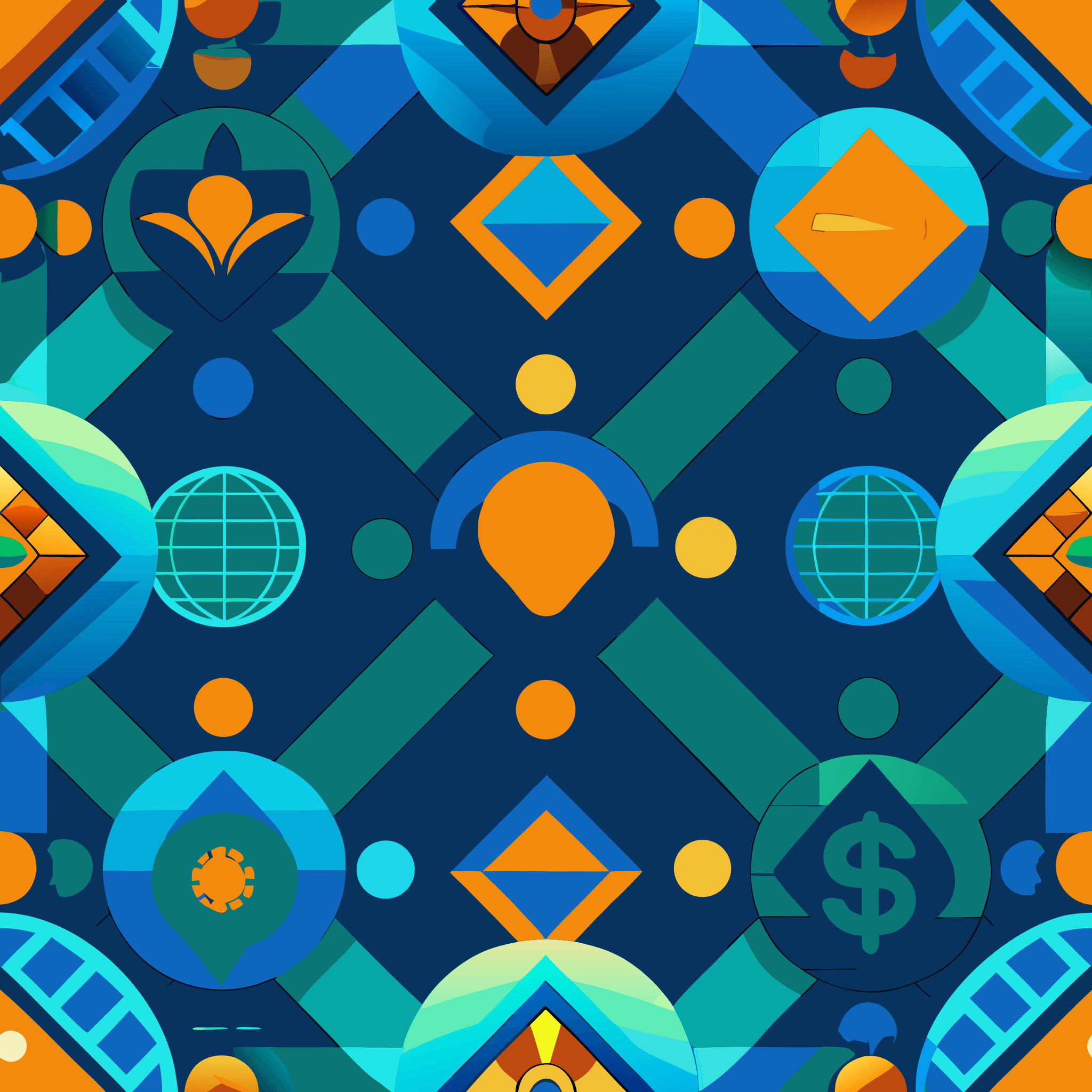 3×3 Tile Preview
Flowing Connections
Organic flowing lines representing the connections between families across borders
 3×3 Tile Preview
Interwoven Paths
Abstract interlocking pathways symbolizing cross-border journeys and interconnected lives
Connection
Growth
Security
Flow
Empowerment
Clarity
We recognize that behind every transaction is a story of sacrifice, love, and responsibility.
We believe our customers deserve complete clarity about costs, processes, and policies.
We hold ourselves accountable for the critical role we play in connecting families across borders.
How well the brand essence "Love moves. We deliver it." resonates across all brand elements
Success Probability
AI-projected likelihood of the rebrand achieving its stated objectives within 18 months
Caregiver's Embrace
Warm, enveloping forms that evoke protection, care, and nurturing support
Ready to transform?
Whether you're defining a new identity or reimagining an established one, BrandingStudio.ai transforms how the world sees you.
Case Study
From 'send money' to 'send love.' A 170-year-old brand finds its soul.